|

|
| |
| Issue 4 |
| June 13, 2020 |
|
|
|
There was a little more healing this week, after such pain last week. Militarized police backed off the peaceful protestors, and local governments began to listen and take action. America is still hurting, but the glimmer grows brighter. There is power in what we designers do and how we influence communications. We must continue to wield that power responsibly.
Roger
P.S. If you are enjoying these emails, please consider forwarding this to a friend.
|
|
| Diversity |
| |

|
| |
|
Representation is powerful
|
| |
|
When I went to design school in the 1990s, of course, graphic design history was part of the curriculum. I didn’t realize it at the time, but everyone we studied—and therefore worshipped—was a white male. For minorities, representation is so powerful. And as the conversation in our country about race righteously heats up and expands from police brutality to systemic racism, it’s time to look at our own industry and ask ourselves about diversity and representation.
Toronto-based creative director Glenford Laughton compiled a great list of 13 African-American graphic designers we should all know. It includes greats like Georg Olden, who was the first African American to design a postage stamp, and Archie Boston, the designer-provocateur who started and chaired the design program at Cal State Long Beach.
According to the AIGA’s 2019 Design Census, just 3% of designers are black. African Americans make up about 14% of our population. Last year, product designer Wes O’Haire from Dropbox created Blacks Who Design. It’s a directory of black creatives on Twitter, giving them a platform to be seen and found, while simultaneously inspiring young people by showing them successful designers who have their same skin color. Representation is powerful.
Hoping to start a dialogue about changing the design industry, Where are the Black Designers is holding a virtual conversation on June 27, 2020.
Aggie Topkins writes in Eye on Design, “Graphic design, by focusing on its own version of monarchs and dynasties, maintains an outdated approach to history that further entrenches it as a hierarchical society.” In other words, maybe it’s time to teach design students about the societal and social changes happening, rather than the individual geniuses who channeled those influences into some work.
|
|
| Communication Design |
| |

|
| |
|
My #hashtag is better than yours
|
| |
|
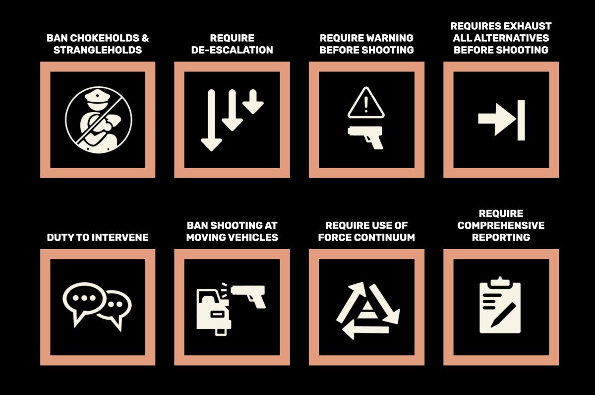
Sometimes it seems like now more than ever, our profession can impact the world. The language of social media is visual, and the catchier the hashtag and the more concise the graphic, the quicker it’ll catch fire. The much denser “Reformist reforms vs. abolitionist steps in policing” chart from Critical Resistance loses to a more focused graphic from #8CANTWAIT.
Lilly Smith writes in Fast Company:
The two images highlight a cold reality of coalition-building in the age of social media: The simpler and catchier a design, the farther its message spreads. This isn’t a new idea. In 1964, Marshall McLuhan penned the phrase “the medium is the message” to suggest that the form of communication is actually more important than the content itself, since the way messages are communicated affects how users receive them—and the type of vessel you choose can even convey a message of its own.
Speaking of graphics and social behavior, the ubiquitous recycling symbol was designed in 1970 by Gary Anderson, a 23-year-old design student. It was for a contest held by the Container Corporation of America to celebrate the first Earth Day. That symbol now adorns nearly every piece of disposable plastic, although not every piece of plastic is indeed recyclable everywhere. The How2Recycle project hopes to clarify things for consumers through better labeling, but John Kazior argues it’s gotta be more.
…John Hocevar, the author of the Greenpeace report, agrees that with greater recycling-data transparency, the How2Recycle label could be a useful tool. But he’s less optimistic about how much labelling communication can actually alleviate the recycling crisis in the US. “The problem isn’t that people are not handling the waste that they use properly, it’s that companies are producing packaging out of material that is essentially fundamentally unrecyclable,” says Hocevar. “Putting the chasing arrows symbols on plastic packaging that is never going to be recycled is not just greenwashing, it’s killing recycling.”
|
|
| Editorial Design |
| |

|
| |
|
The possibilities of online editorial design
|
| |
|
Graphic design, at its best, enhances content, helping stories become more vibrant and more compelling. Jessia Ma, a digital art director at the New York Times, speaking to Design Week about an article in 2018 that didn’t get much traction as a text-only article, but soared when enhanced with graphics and animation:
“The piece is a testament that visuals don’t just have to be window dressing or to make things look better.…In this case specifically, the visuals and graphics are making a lot of the points or the argument itself.”
There have been many great data visualizations of the impact of Covid-19. Here’s another simple yet jaw-dropping one by Mark Perry. It doesn’t accompany an article, but I think it speaks for itself.
|
|
| How-To |
| |

|
| |
|
How to be indispensable to your clients
|
| |
|
ROI. That’s it. Designers are supposed to be human whisperers—both for the users and audiences we design for, and our clients. So when we talk to our clients, we should speak their language, which is business. Alen Faljic gives us a primer on how to calculate ROI, which boils down to:
- Define a business lever.
- Estimate the financial impact.
- Communicate with hypotheses.
BTW, based on research Upwork did recently, freelancers may be in higher demand soon.
“Businesses really find a lot of value in flexible talent in a variety of situations,” said Upwork’s Chief Economist Adam Ozimek. “This is one of those situations. Companies are having to pivot very quickly and to quickly adapt to remote work and having to change their businesses in a variety of ways. Some of them are trying more flexible talent and finding it works, especially in circumstances where you need to move quickly and grow and scale dynamically.”
|
|
| |
|
What Else?
|
| |
|
Apple Maps already updated with Black Lives Matter DC mural. Satellite imagery on map apps is not in realtime. Sometimes it will take months, if not a year, for maps to refresh. But Apple (and Google) updated its imagery to show “Black Lives Matter” painted on the streets of Washington, DC, just a couple weeks ago.
Apple, NeXT veteran Joanna Hoffman calls today’s technology leaders’ remarkably ignorant.’ “Former Apple, NeXT, and General Magic marketer says Facebook is ‘peddling in an addictive drug called anger,’ and many modern tech firms are ‘flawed,’ or ‘devious.’”
What should we expect from Apple’s transition to its own processors? Apple could be changing processors for Macs again. The last time was about 15 years ago when Macs switched from PowerPC processors to Intel.
Move over data visualization. The era of ‘data simulation’ is here. “Simulations…allow us to experience data differently from static graphics or video explanations of complex concepts. Rather than passively consuming information, we’re immersed in the outcomes…”
The Design of the SpaceX Spacesuit Explained. The crisp new spacesuit was designed by a Hollywood costume designer who worked on Marvel movies, ’natch.
|
|
|
|

