|

|
| |
| Issue 15 |
| September 6, 2020 |
|
|
| |
|
| |
| eyeondesign.aiga.org |
| |
|
The Solution to Deepfakes May Not Be As Technological As You Think
|
| |
|
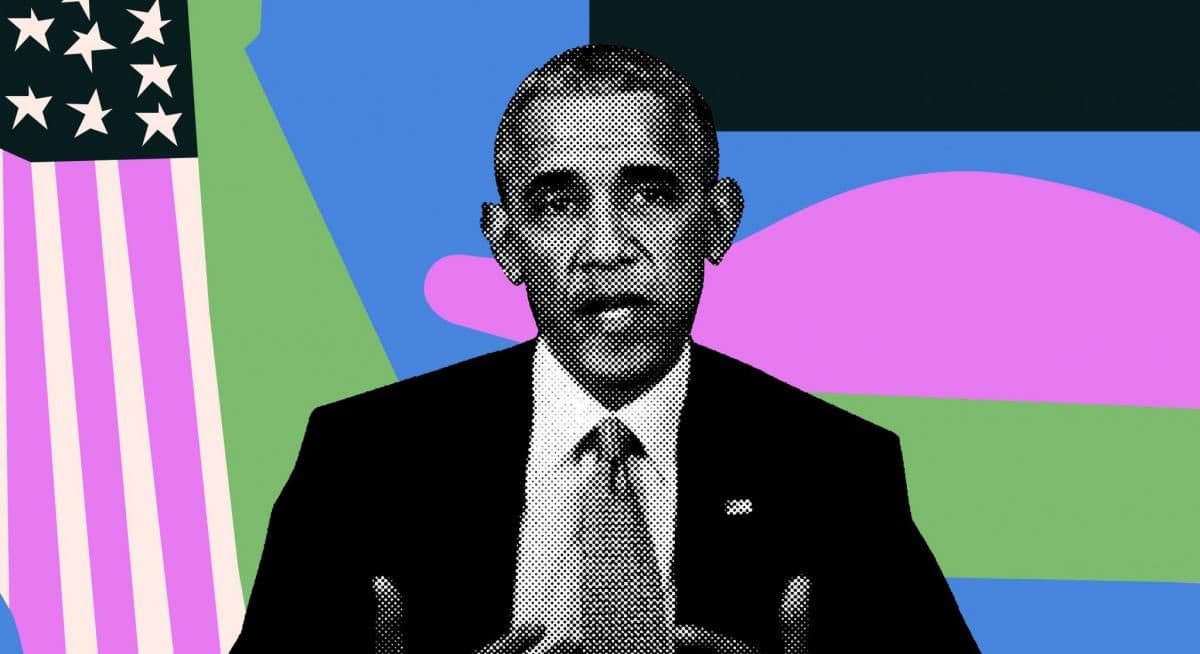
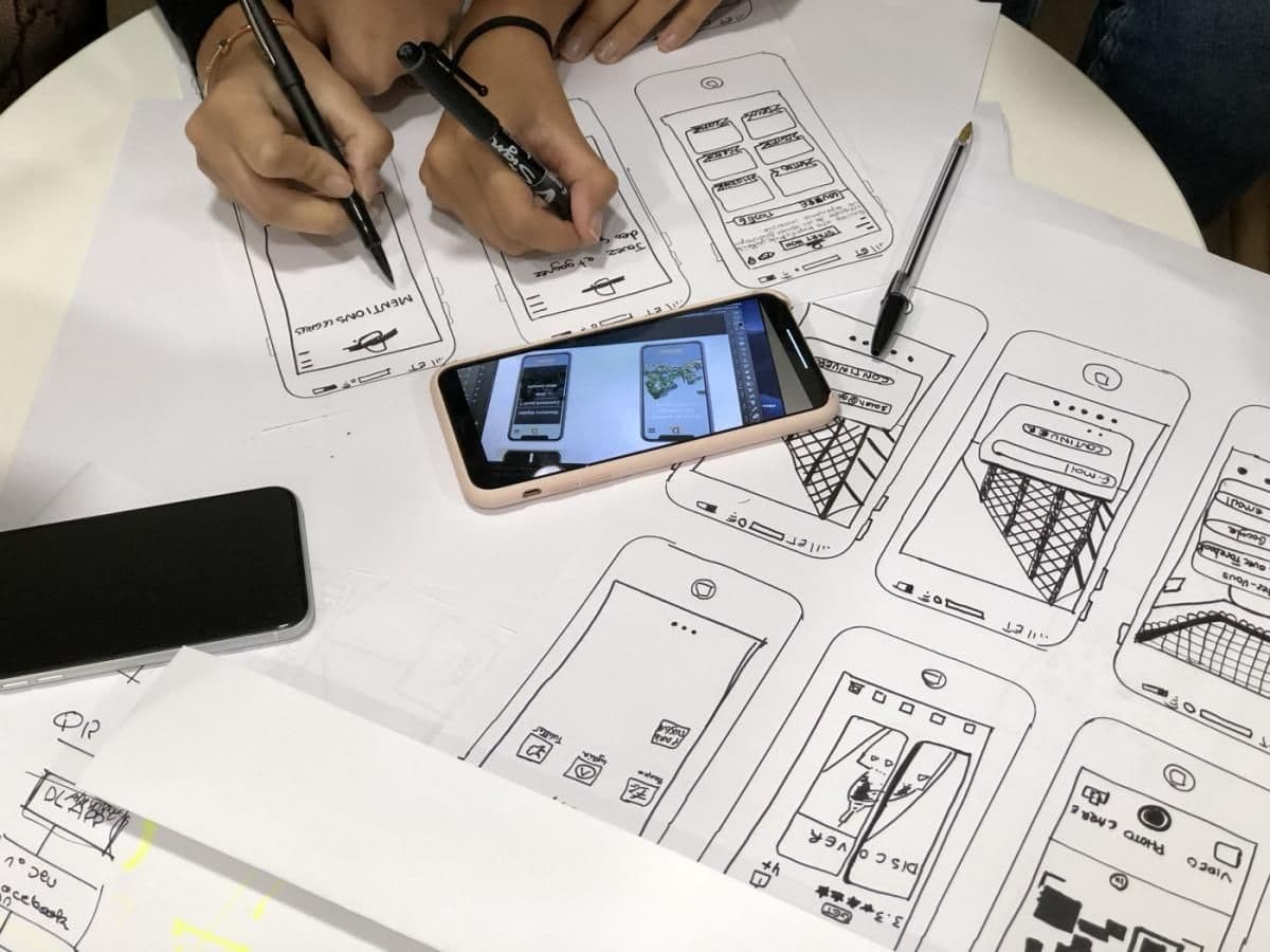
The term “deepfake” has been bubbling up in recent years. It describes an artificial intelligence technique that uses machine learning to put one person’s face on the body of another. It’s like having the computer create really great Photoshopped images—by the thousands.
Eye on Design’s James Cartwright:
Despite advances in his research, [researcher Siwei] Lyu believes the solution to deepfakes is neither technological nor legislative. “User education and media literacy is the biggest issue here,” he says. “A lot of people can be fooled by these fake videos because they simply don’t know that videos can be manufactured and manipulated in this way. It’s like a virus. When a virus attacks a society for the first time, people get sick, not because they don’t know how to protect themselves, but because they don’t know that there is a virus. But once they know about the virus and take proper measures to protect themselves, then the virus can be controlled.”
Be sure to view the linked video of Jordan Peele voicing a convincing Barack Obama. Then take a look at a more recent deepfake that replaces Alden Ehrenreich, who played the titular character of Star Wars spinoff Solo, with the original actor who played Han Solo, a young Harrison Ford.
Finally, for an in-depth look at how it’s done using mostly off-the-shelf software like Adobe After Effects, see how Corridor Digital created a deepfake of Tom Cruise.
|
|
| |
|
| |
| marker.medium.com |
| |
|
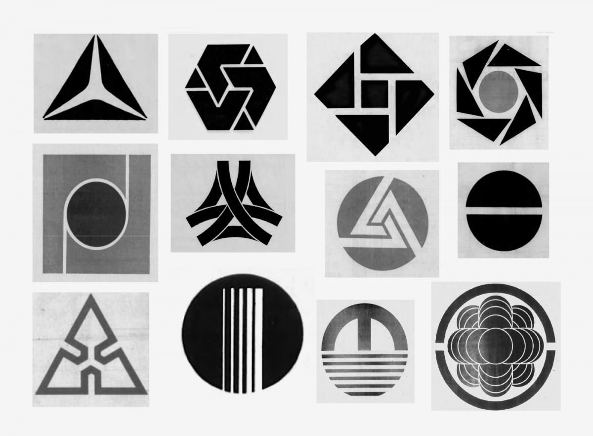
The Surprising Reason Why All Bank Logos Look the Same
|
| |
|
There’s always a zeitgeist in design, an overall trend. James I. Bowie went back into newspaper archives to uncover 327 ads placed by banks announcing their new logos.
The ultimate effectiveness of these old banking logos, as well as that of today’s symbols, hinges not so much on how well they differentiate, but on their ability to signal legitimacy by hewing to the current conventions of visual design.
|
|
| |
|
| |
| getrevue.co |
| |
|
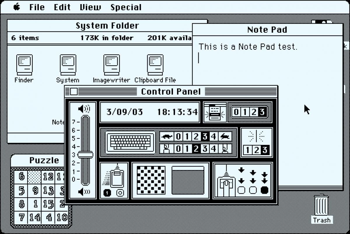
A tale of three skeuomorphs
|
| |
|
Skeuomorphism is a technique to replicate real-world objects, textures, or interactions digitally in user interfaces. Marcin Wichary:
The premise was pretty fantastic. During the 1970s and early 1980s, people at Xerox Parc and Apple wanted to simplify computers to make them more palatable for people who never used computers before. On the hardware side, that meant mice and nice graphical displays. And what was shown on those displays – a pixelated representation of their offices – made perfect sense to office workers meant to use them: papers that you could drag to a printer, a clipboard to keep snippets of text, and a little calculator resembling the one on their desk. And, in the corner, a trashcan they could use to get rid of unwanted documents.
|
|
| |

|
| |
| viget.com |
| |
|
Web Brutalism, Seamfulness, and Notion
|
| |
|
In this smart article from UX designer Brandon Dorn, the author connects the Brutalism architectural movement to web design and Notion, the latest do-everything note-taking app.
Most of what’s labeled Web Brutalism is a normcore visual aesthetic — the web version of anti-art, a rejection of refinement and sophistication — rather than a meaningful digital analogue to architectural Brutalism. Coined by Swedish architect Hans Asplund, “Brutalism” described a style of architecture that intentionally revealed the underlying structural materials, derived from the French béton brut, “raw concrete”.
…
This, I think, is the brilliance of Notion, and what makes it one of the best examples of “fidelity to digital information” that I’ve come across. The structure of the app reflects the structure of the web itself: digital content is purposefully formatted, like semantic HTML elements, and exists in a hierarchical structure (directories on the web, nested pages in Notion), yet can be linked and referenced to create a complex network of information.
|
|
| |
|
| |
| uxplanet.org |
| |
|
20 Laws of UX Design
|
| |
|
Tokyo-based product designer Enja put together a list of 20 “laws” of UX. From Fitt’s to Hick’s, from Occam’s Razor to the Zeignarnik Effect, it’s a deceptively quick read, mainly because each point links out to an article explaining the law.
|
|
| |
|
Upcoming Events
|
| |
|
San Diego Design Week (Wednesday, September 9–13, Mostly free programs) With over 30 sessions to choose from, this will be a great event. This year’s theme asks, “How are designers collaborating across disciplines to exchange ideas and build and serve our community?”
Exploring Design + Ethics (Thursday, September 10, 3pm PT / 6pm ET, Free) Leaders from IBM, American Specialty Health, and others will discuss our moral obligations as designers, who can have so much impact on today’s society. This thought-provoking event is organized by our friends at Nilll Design.
PaperSpecs Live [Unboxed] (Thursday, September 17, 11am PT / 2pm ET, $19) This packaging mini-conference has an offline element to it, but you have to act fast to get your package in the mail.
|
|
| |
|
What Else?
|
| |
|
Google Offering $400, Six-Month Online Certificate in UX Design, “the Equivalent of a Four-Year Degree” (core77.com) Google announced a program to offer courses that will teach people UX design in six months. We’ll have to see how that goes. In my mind, certain skills can be learned in that time, but IMHO, visual design is best mastered in a four-year program.
Figma Community: the Github for designers (uxdesign.cc) The recently launched Figma Community enables the sharing of assets, files, and plugins by members, very similar to GitHub, so the author argues.
Twelve years later, Apple is still trying to erase mac.com email addresses (appleinsider.com) Interesting look back at the various email domains Apple gave its customers through the years. I wish I kept my [email protected] address. ????♂️
Biden campaign launches official Animal Crossing: New Horizons yard signs (theverge.com) If you’re playing Animal Crossing on Nintendo Switch, you can get your very own Biden & Harris yard signs.
The Battleground States Biden and Trump Need to Win 270 (nytimes.com) This visualization from The New York Times allows you to simulate the upcoming election.
|
|
| One More Thing… |
| |
|
| |
|
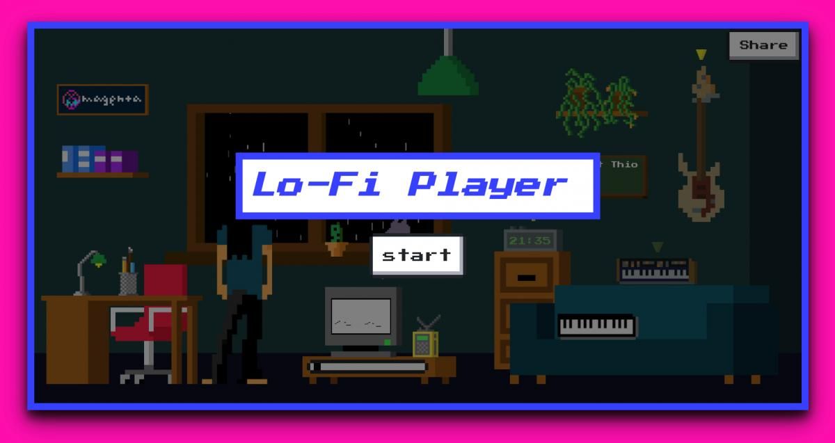
Vibert Thio, a summer intern at Google Magenta, created this AI-powered melody maker called Lo-Fi Player. Magenta is a project of Google’s that tries to make art using artificial intelligence. Lo-Fi Player lets you mess around with different sounds to accompany a fully-AI-generated melody. Here’s the track we put together on a warm late summer evening in Southern California.
|
|
|
|